Key Points
- We released Wealthbox version 1.1 after studying how our customers physically interacted with the app on desktop and laptop screens. Office ergonomics meets interface design.
- Interface architecture remains the same, yet visual changes include left-side navigation color inversion, color-coding on secondary pages, and improved permissions and notification interactions in the publishing zone. Font sizes in critical areas have also been enlarged.
- Enhanced interface design improves visual focus, readability, and communication workflows for better productivity and ease of use when using Wealthbox. The 1.1 interface also visually matches our forthcoming mobile app, releasing in May.
Launched just last month, we’ve been delighted by the user feedback to Wealthbox CRM. Our customers repeatedly tell us Wealthbox is “amazingly easy to use” and “uniquely collaborative.” Said one advisor in an RIABiz article about Wealthbox on its simplicity, “it reminded me of the first time I used an iPhone.”
Our design wasn’t broken and didn’t need a fix, so we fixed it. Here’s why…
We use the core CRM features of Wealthbox internally to track contacts, manage tasks, and collaborate for business development purposes. (In the tech space, there’s a term for this called “eating your own dogfood” and we’ll have another blog post about this soon.) In using Wealthbox we had some hunches based on our own experiences on how it could be improved, but we wanted to validate this with customers.
We do a significant amount of app monitoring and testing of Wealthbox usage with various analytical tools. On a granular basis, we can see which features and attendant data fields, buttons, and links users interact with, but apart from some casual over-the-shoulder user observations during our beta program last year, we hadn’t actually watched our users in their offices using Wealthbox. So we did.
Ergonomics is the study of people’s efficiency in their working environment. Analytical data of app usage in Wealthbox, while highly valuable and our leading barometer of customer experience, doesn’t tell the complete story. We wanted to see how our financial advisor customers were literally working with our CRM, in the physical settings of their offices. It’s ergonomics meets interface usability.
We asked several of our NYC-based customers if we could sit a few feet away from them in their office for a few hours as they went about their business. From these observations and their feedback, here are the new enhancements in Wealthbox 1.1 that were released today.
Enhancements in Wealthbox 1.1
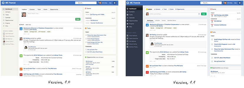
No Leaning, No Squinting: Increased Font Sizes in Critical Areas
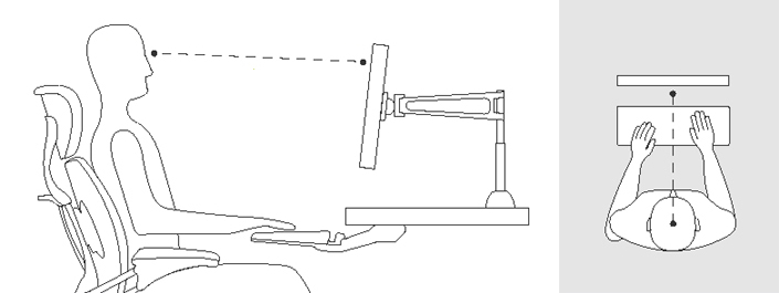
Few people get into a posture that’s optimized for computer interaction when seated in a chair at the office. Our advisor customers are no exception. Slumped over. Leaning back. Swiveling. Walking about the office. Entering data while on the phone that’s pressed between jaw and shoulder. You name it. Advisors aren’t frozen mannequin models at computer stations. Advisors are moving around constantly and in different positions while engaging with technology.
Amid all this movement in the normal activity of a day, we observed our advisor customers engaging with the Wealthbox interface to enter notes about contacts and send updates to their coworkers, via the front and center “publishing zone” on the dashboard. We noticed many were leaning in or squinting slightly when doing this. We also noticed leaning in whenever someone looked up a contact profile to get a phone number to make a call. What’s interesting is that we had long ago anticipated and designed for this, particularly with a customer base whose sets of eyes skew older, yet still, we needed to improve the readability.
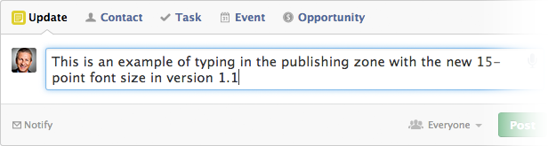
The solution: 15-point font size in the all-important publishing zone, and larger displays of phone numbers on contact record pages for easy viewing at a distance (often while tilting in a chair and dialing a phone, as we observed).
Show & Tell. (Or Keep it Private.)
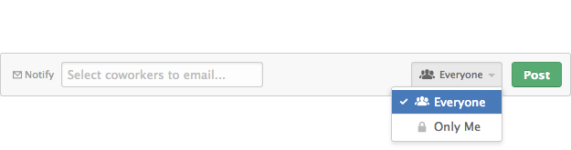
Based on research and feedback, we improved the way a user sets the permission for a given data input (eg. adding a new contact name) and communicates with his or her coworkers when they wish to “notify” by email of that action. It’s a simple change but one that’s an easier flow and more intuitive. We also added easier to comprehend icons in the permissions dropdown menu.
Never Get Lost: Color-Coded CRM Sections
Great product experiences in software come when the user isn’t aware that he or she using technology. The title of an excellent book written about web usability is called “Don’t Make Me Think” and it’s an inspirational mantra for the team at Gotham Tech Labs, makers of Wealthbox CRM. We’re constantly asking ourselves (and validating in analytics) whether or not our customers are “thinking” or are confused by something in the Wealthbox interface. But analytical user data in an app doesn’t always tell the whole story.
CRM systems today can make you feel like you’re lost in a garage parking lot of data. There’s a sameness to the pages as there’s a sameness to the floors of a full parking garage. You park you car – like you store your data – and then your mind asks, Where am I now? Where am I going? How do I come back? …You’re “thinking.”
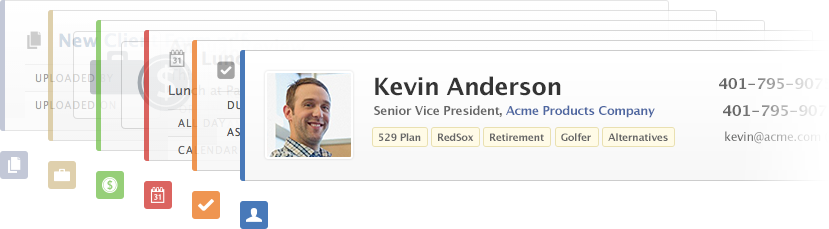
Modern parking lot operators some time ago started applying what we did with the release of Wealthbbox 1.1: color coding. In our on-premise studies and live questioning of advisors using Wealthbox, we found that occasionally a customer would “think” for a split second as to where they were in the app. Were they viewing a contact page? A task page? An opportunities page? A project page? Just for a second, they had to “think.” We wanted less thinking and more intuition, so we experimented with several design treatments and came up with not only improved title headings for each page, but also added a lightweight color-coding manifested in a vertical bar on a given Contact, Task, Opportunities, Event, File, or Project page. It’s a simple treatment, and it better connects the original icon colors to the respective pages of the various CRM data objects.
Focus on the Action: Color Inversion of the Left-Side Navigation
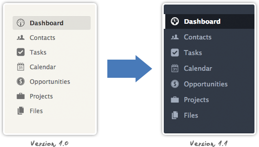
Wealthbox 1.0’s light and airy visual design presented a large, wide canvas, using white and off-whites. When new users were signing on, some were wondering what the difference was between the left-side vertical navigation (to go to different sections in the app) or the top horizontal links (to input data right from the publisher). In feedback from those users and validation from our on-site research interviews, we decided to invert the left-side navigation color from an off-white to a dark gray with a blueish hue. This visually compartmentalizes the broad white canvas of version 1.0 into an easier to focus interface. This design effect focuses a user’s attention to where the action is: the center publisher and attendant activity stream.
On a final note, Wealthbox 1.1 will also visually match our forthcoming mobile app, to be released in May.
Coming Up: Version 1.2
Get notified of our next version release by signing up to the Wealthbox newsletter. We hope to release version 1.2 within a few days. The next two months will see some really big feature releases in Wealthbox, so stay in the loop. Thanks!